
Good Morning Splodgers,
How are we all today?
Right now the SplodgeAway Design Team are busy making samples for the Create and Craft Show next Friday, as soon as we have a time I shall let you know.
Today Claire has been kind enough to give us her review of the SplodgeAway A4 Elegance High Res Card.


What can I say about this card? GORGEOUS? I want it, I LOVE it!!!
Claire used the SplodgeAway Fairy Dust mask on a Glimmer mist background, I popped them through the Grand Calibur and then applied versamark through the mask and embossed with a sparkly white embossing powder. Image coloured with promarkers on Elegance Card.

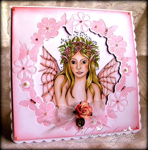
Claire used the SplodgeAway Beautiful Butterflies and Distress Inks/gesso for the background.

Claire has used the Graph'It markers and Elegance Card for the image, frame created with SplodgeAway Butterfly Wreath, brayered with Worn Lipstick Distress ink and popped through the GC.

Claire has used the Fairy StenSkape and PanPastels with the foliage stamped in with Memento inks and white gel pen on the toadstools
Claire has used the SplodgeAway Elegance High Res Card for all these projects and can be bought from the SplodgeAway Website. 25 A4 sheets for £4.99.

How are we all today?
Right now the SplodgeAway Design Team are busy making samples for the Create and Craft Show next Friday, as soon as we have a time I shall let you know.
Today Claire has been kind enough to give us her review of the SplodgeAway A4 Elegance High Res Card.


What can I say about this card? GORGEOUS? I want it, I LOVE it!!!
Claire used the SplodgeAway Fairy Dust mask on a Glimmer mist background, I popped them through the Grand Calibur and then applied versamark through the mask and embossed with a sparkly white embossing powder. Image coloured with promarkers on Elegance Card.

Claire used the SplodgeAway Beautiful Butterflies and Distress Inks/gesso for the background.
Claire has used the Graph'It markers and Elegance Card for the image, frame created with SplodgeAway Butterfly Wreath, brayered with Worn Lipstick Distress ink and popped through the GC.

Claire has used the Fairy StenSkape and PanPastels with the foliage stamped in with Memento inks and white gel pen on the toadstools
Claire has used the SplodgeAway Elegance High Res Card for all these projects and can be bought from the SplodgeAway Website. 25 A4 sheets for £4.99.
This is what Claire thought of the card:
The
elegance card is super smooth, I've found it perfect for using with
alcohol markers - tested with Graph'It Markers and Promarkers/Tria
markers.
Firstly
its very easy to stamp on and gives a crisp clear image. I've also used
it for digi stamp and had no problems with printing at all, my printer
is very temperamental with some card but this printed perfectly first
time.
Usually
when I colour an image, I blend layer upon layer until I'm happy
with the colours and the blending. I start with the darkest shades to
create the shadows and gradually add the lighter shades but often find
myself repeating this several times until I'm happy with the result. I
found that I didn't need to do this with the Elegance card as it gave a
beautiful smooth blend first time which is a huge plus for me as it
saves time and of course ink too.
Another
really big plus is the lack of bleeding, the ink stayed where I wanted
it without bleeding into adjoining areas, I think this is helped by the
fact that you don't need to keep going over and over the same area to
get a good blend.
I
also found that the blender pen
works a treat on the Elegance card, blender pens act more as an eraser
than a true blender and will remove some of the ink. I dropped a purple
marker on the face of the image in the Fairy Dust card -disaster!! I
just touched the purple with the blender pen and it lifted off
completely in seconds.
All in all I'm very impressed with the Elegance card, its perfect for using with alcohol markers :-)
Thank you to Claire for beautiful samples x Don't forget to check out Claire's Blog for more inspiration.
Check back tomorrow to see what Angela thinks of the Elegance High Res Card,
Happy Splodging
Susan xx
Check back tomorrow to see what Angela thinks of the Elegance High Res Card,
Happy Splodging
Susan xx
Wow! Fab cards and great review, your colouring in skills are enviable xx
ReplyDeleteLove all ur cards but my fave is the fairydust 1. Ur colouring is fab! Great review too. X x x
ReplyDeleteGorjuss hun, I love the first one....perfect x
ReplyDeleteAmazing. Love them all Claire - such a talented ladyxx
ReplyDeleteNot bad little cards there Claire!! Oh OK OMG!!!Gorgeous. Sam
ReplyDeleteWow!!!! They are fab Claire. The card is gorgeous isn't it?:-) xi love the colours in the fairy dust one ...x
ReplyDeleteWhat can I say. Absolutely fabulous!!!!!x
ReplyDeleteWOOOOHHHH!! What a super selection of cards you have created and isn't the card fab!!! You did so well trying it with so many mediums to produce some wonderful effects. Great write up too.
ReplyDeleteCarol xx